What a Deep Learning algorithm says about composition, style, and the relationship between Machine Learning and the arts
Ever seen a hand-colored historical photo? They’re works of art, with a skilled person painstakingly coloring in each part of a black and white photo, adding skin tones, backgrounds, and more. They’ve been popular since the dawn of photography, and are still made today — the only difference is that the artist today uses Photoshop instead of a paintbrush.
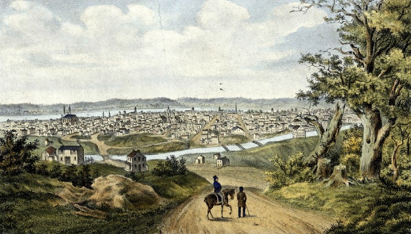
Hand-colored photos are beautiful, but making them is slow work. You have to make decisions about the colors to add in, have the painting skills to place them into the original photo, etc. Even with modern tools, hiring an artist to colorize a single historical photo costs between $300 and $500.
A Deep Learning Approach
Enter Convolutional Neural Networks. In many cases, the colors in an image are unique — the exact color of a person’s clothing, the perfect shade of green for a tree, etc. are lost forever the second a black and white photo is taken. In other cases, though, colors are predictable — surprisingly so. Skies are usually blue (or could plausibly be blue), greenery is green, people’s skin is skin colored, water is blueish, clothes usually aren’t garish or crazy colors, etc.
Because color is more predictable than you’d think, it’s almost more tractable using Machine Learning than you might initially think. This means you can actually use a Convolutional Neural Network to colorize historical black and white photos.
Colorful Image Colorization is an algorithm which uses a CNN to analyze the colors across a set of color images, and their black and white versions. Training data is easy to obtain here — any color image can be changed to grayscale, and then paired with its color version to make an easy training example. The algorithm uses several feed-forward passes to ultimately take in a grayscale image, and in the words of the algorithm’s creators, “hallucinate” a plausible (though not necessarily correct) set of colors to fill into the image.
Colorful Image Colorization was trained on over 1 million images. Its creators report that when the results were shown to humans in a “colorization Turing test”, people believed the colors were real 32% of the time. That doesn’t sound like much, but remember, this task was even harder than just plausibly colorizing a historical image. People in the Turing test didn’t just believe the image they were seeing was a well-executed hand colorization — rather, they believed the image really was a color image. Doing this was a machine from a grayscale original — even 32% of the time — is quite an accomplishment.
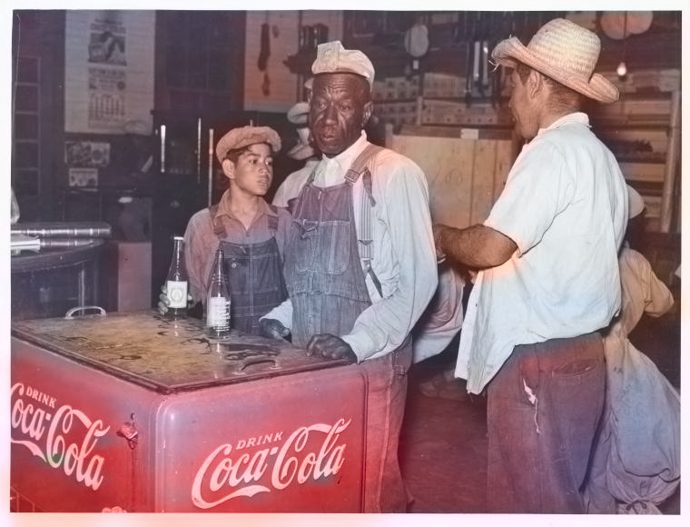
Some pretty remarkable emergent properties bubble up in the algorithm’s results. Given a grayscale historical image with a Coca Cola logo, for example, it correctly colors the logo Coca Cola red — presumably from seeing thousands of training images with red Coca Cola logos. Importantly, the algorithm was never taught what a Coca Cola logo is — through the magic of CNNs, it figured this out from looking at lots of training data.
So Is Color Worthless?
When I first started testing Colorful Image Colorization on grayscale images, my first react was unease, bordering on disgust. As a professional photographer, color is hugely important, and a big part of my work is getting the colors in an image exactly right, choosing subjects based on their vibrant colors, etc. The idea that so much of color was pre-determined — enough so that a machine could guess at the colors in a scene and get it approximately right — was disturbing and a little depressing. Was color really an interesting element of a composition, or was it something that could be filled in later as an afterthought by a hallucinating computer program?
This perspective certainly has plenty of historical precedent. Famed documentary photographer Henri Cartier-Bresson — best known for his photos of Gandhi and intimate street portraits of people around the world — summed it up quite succinctly to his contemporary William Eggleston: “William, color is bullshit.” And Ansel Adams — perhaps the best known American photographer of the 20th century — was deeply skeptical of color throughout his career. It’s deliciously ironic that the creators of Colorful Image Colorization chose to demonstrate their process by colorizing some of Adams’ images in their first paper about the algorithm.
So is all of color predetermined? Can we release a brilliant new compression algorithm, where cameras take their photos in grayscale, and a CNN like Colorful Image Colorization fills the colors in later in the cloud? Is historical black and white photography dead? Should we throw out Adams’ glass plates and replace them with brilliantly colorful prints of his landscapes created by a machine?
Surprising the Algorithm
Not so fast. Like many systems built on Convolutional Neural Networks, Colorful Image Colorization produces some remarkable results, but it struggles with edge cases. And thankfully, the world of visual arts is full of edge cases.
The images where Colorful Image Colorization does best are those with predictable compositions — a blue sky above, some scenery in the midground, perhaps a nice obvious tree for good measure, and some water in the foreground that it can make blue. Lots of vacation snapshots turn out great with the algorithm. In a sense, it does best on “average” images — those whose compositions and colors don’t deviate much from the average composition and average colors of the 1 million images on which it was trained.
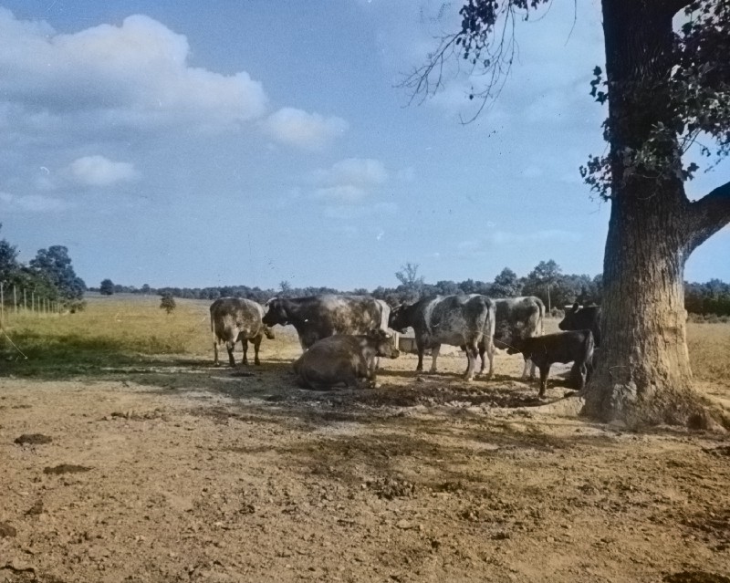
For images with different compositions, novel objects, and unconventional colors, though, the algorithm struggles. Cities, murals, colorful markets, images with lots of non-sky negative space — on these images, Colorful Image Colorization falls flat.
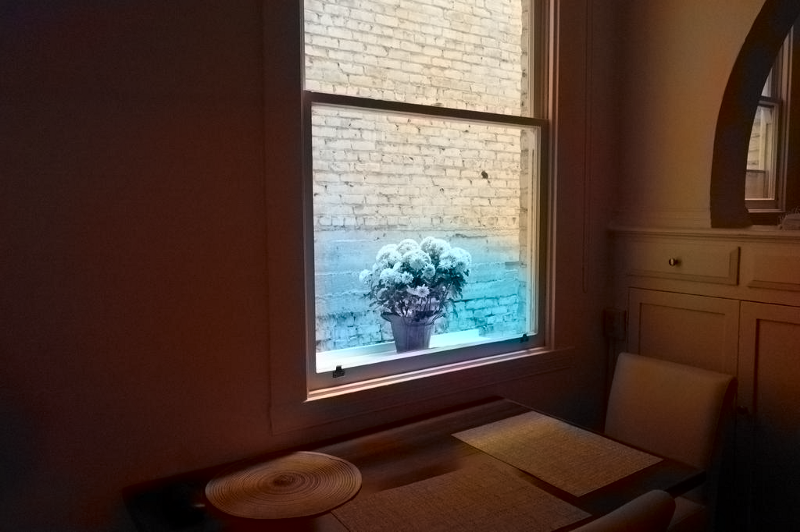
In a sense, then, the algorithm is actually a pretty good indicator of the uniqueness of an image. If your image looks pretty good after colorization by the algorithm, it’s probably a fairly “average” image in terms of composition and color — it doesn’t deviate much from the millions of images on which the system was trained. This doesn’t necessarily mean the image is bad — plenty of compositionally average images are commercial gold mines or depict a significant person or place. Sometimes an average image is good, especially when you want your composition and color choices to get out of the way and not interfere with the image’s documentary content.
But if you create an image which “surprises” Colorful Image Colorization — yielding weird or inaccurate results — pat yourself on the back. You’ve created something which deviates from the average enough to fool the algorithm. In short, you’ve created something artistically unique.
For me, this redeems the artistic process around color. If you want an image that follows visual norms, it’s good to run it through Colorful Image Colorization and see that even a computer can guess at its colors. But it’s also comforting to see that unique or visually different work can fool the algorithm — it’s proof that not all of color is predetermined, and a human artist has the ability to be surprising.
The Algorithm in Practice
So beyond a neat Machine Learning party trick or a tool for validating your artistic choices, does Colorful Image Colorization have value?
Absolutely. On certain historical photos — especially portraits — the algorithm yields results which are extremely believable, and lend a depth and vibrance to images which would otherwise be flatter and less alive. For many of these portraits, the photographer would likely have used color film had it been available, so colorizing the images really amounts to filling in details they probably would have included had they been able.
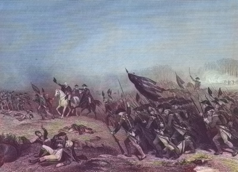
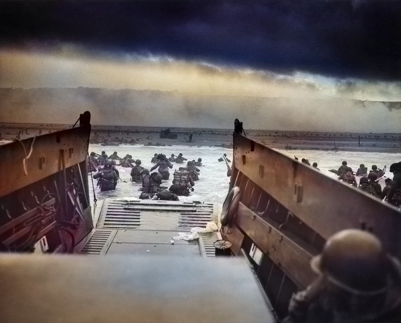
And in some cases, the algorithm’s hallucinations are art in and of themselves. Running classic images like Into the Jaws of Death (which shows American soldiers disembarking into a wall of gunfire during the D Day invasion in Normandy) yield haunting dreamscapes where the color builds upon and enhances the original composition.
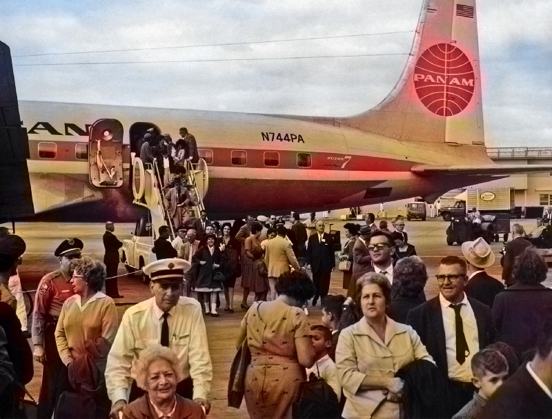
Despite its power, Colorful Image Colorization does have blind spots. While the colors it hallucinates are plausible, they‘re not always historically accurate — the Pan Am logo in the image at the top of this article looks great in red, for example, but it was actually blue.
Also, likely as a result of being trained on lots of historical photos which had sepia tones rather than true color, it tends towards rendering historical photos in muted shades of yellow and tan. One interesting experiment would be to train the algorithm on a set of historical images which really were shot in color — like a large archive of Kodachrome slides — and then see how this new version does on colorizing historical images. A CNN which could fill in Kodachrome-like colors would be fantastic for working with historical images, and could yield some really engaging results on images shot today.
Machine Learning and the Arts
Ultimately, Colorful Image Colorization is a compelling example of the interesting synergies that can happen when two very different fields — Machine Learning and the arts — come together. You wouldn’t expect that a neural network for guessing colors could prompt existential questions about composition, subject choice, and the uniqueness of photographic works. Nor would you think that it could reignite a dialog with art history perspectives — like those of Cartier-Bresson and Adams — which are over half a century old. But look at the results of Colorful Image Colorization, and these questions come up.
As Machine Learning impacts more industries, I hope that visual artists — and all artists, really — start to engage with the questions that these technologies raise, both about society and about the artistic process itself. Machine Learning needs the perspectives of artists, creatives, and other thinkers from across society if it’s going to continue to grow. But at the same time, Machine Learning can give something back, showing new ways to look at artistic work or even new ways to create it. Systems like Colorful Image Colorization show that when it comes to Machine Learning and the arts, the dialog goes both ways.
